Queen’s University Stewardship Reports
Scope: to design Stewardship Reports to highlight the significance of donors generosity and to inspire philanthropy in others
Deliverables: 100+ page Bader Stewardship Report, 20+ page SEAMO Department of Surgery Association Impact Report and a 70+ page Dr. Bruce H. Mitchell Stewardship Report — as both digital pdfs and printed books
Editorial design — stewardship report
This report was the first to use the new design I came up with for Impact and Stewardship Reports. The line motif, is a visual element that was developed to tie all the reports together and is flexible enough that it could be used in unique ways, and interact with a wide range of content.
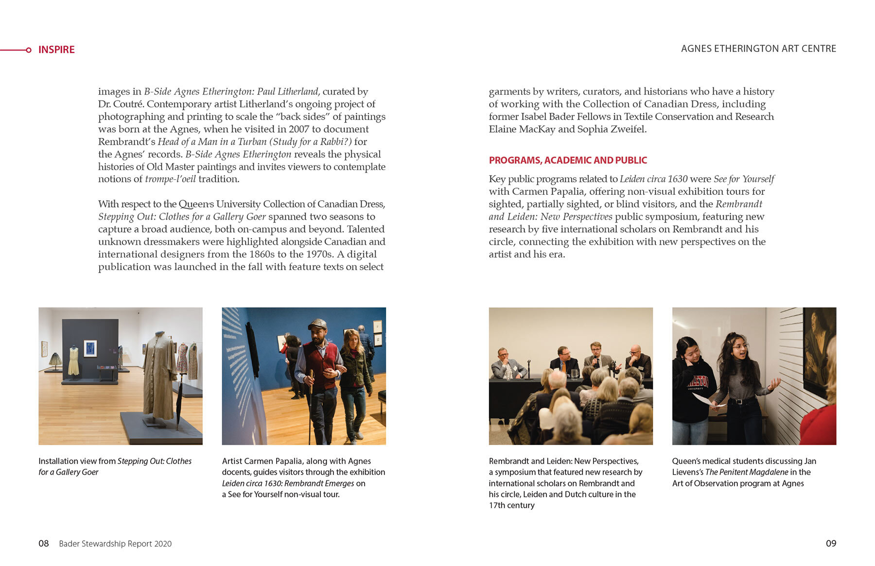
This report is an 8.5" x 11", perfect bound print book and was designed to accommodate a large font size. There were many authors — being that the Bader's have touched on so many areas of Queen's University — and each entry is it's own chapter. The chapters have a special treatment with a beautiful full page photo and larger lead in text.
The overall meaning was especially considered in the structure and content of this report. Starting on the cover with the united statement and a thesis on the inside, all of the following content serves to support them. Each chapter does so, with a unique tenet, which appears at the top left the page. At the end of the book, the tenets are repeated in a special spread, to reinforce the thesis and to close the book in a memorable way.
Editorial design — impact report
This report was the second, to follow the new design. The line motif carried through but the colour was changed to red and the size was 9"x9" and it was saddle-stitched. This being a thank you to the Department of Surgery and not addressed to an individual, made it unique. One of the priorities, was to show the timeline and the cumulative effect of inspiring philanthropy in others, in order to lead to new discoveries and positive change for patients.
Editorial design — stewardship report
This third report, highlights the story of the Mitchell Hall building and the various areas that operate within it, that allow so many initiatives to come to life. One of the design structure ideas I came up with was to have a narrative story woven throughout the document and be an opportunity to show impact. The narrative in this report was treated with a yellow duotone effect and it acted as a striking breather before each new section. One of the priorities of this report was to highlight the facts, therefore, I pulled out side bar content to feature. The photos highlight the beautiful structure and the innovative people within it.


