Ontario Racing
Scope: to produce design items for a variety of purposes, including communicating information to those involved in racing, to promote events and to encourage participation in programs. ORC was an ongoing client and I had the opportunity to be the key contact and the lead of many design projects, see a sampling below.
Deliverables: Event poster, web ad (animated gif), Racing Guide, Racing Date Poster, Children’s Activity Book, pop-up banner, post card and flyer.

Event poster design
I started the above poster, by coordinating with photographers, reviewing their shots and passing a few choices for approval to the client. I then proceeded with the design — my goal was to create a poster full of action and drama. Also, to generate excitement so people would not want to miss the events. I created a gold version of the logo, which adds an element of sophistication to the poster, and pops from the rich navy blue in the background.

Web ad — rotating gif banner
Over the course of working with the ORC, I created many web ads. This one corresponds to the event poster, including the navy background and touches of gold.
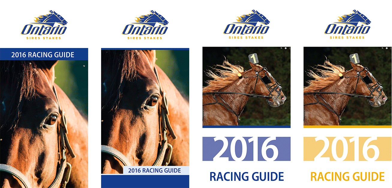


Editorial design — cover process work
Here is example of design process work for the cover of this racing guide. It shows how I worked within a consistent structure, to match their brand and played with ideas. Again, I was able to coordinate and review the shots from photographers — all these options, were rough explorations, which were shown to my creative director.

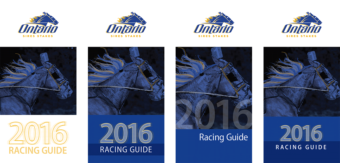
Editorial design — cover process work
Once a design direction was chosen, I explored and refined further with the samples above and sent a few to the client to choose from.

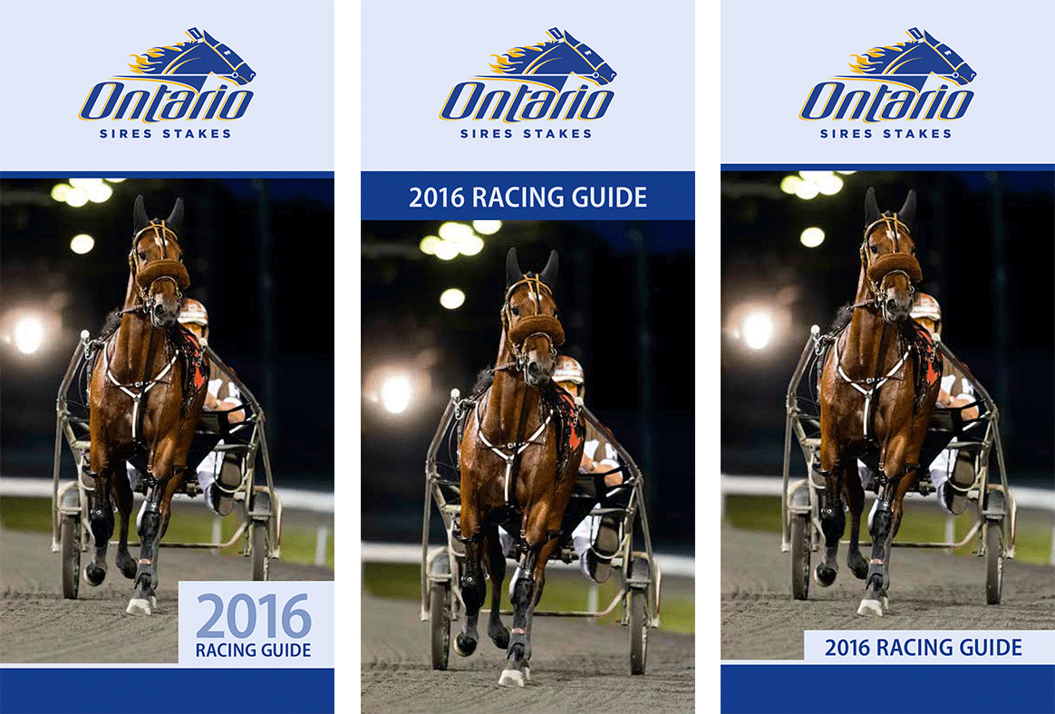
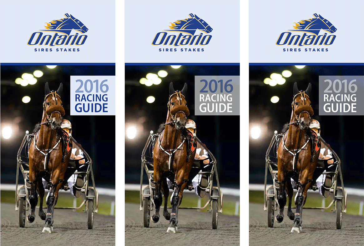
Editorial design — racing guide cover + pages
Above is the final cover (right), it is simple, graphic and from a unique viewpoint. The front view captures great detail and was intentionally cropped to mimic how an audience member would zone in on “their horse” during a race. A sample spread (left), shows a section divider and a race date page.

Racing date poster design
For the various race track locations in Ontario, I designed large 35” x 58” posters.

Activity book cover + poster design
This activity book and poster design, provided another opportunity to chose from stunning photographs. To bring the photograph to life on the cover, I photoshopped the horse, so her head poked above the coloured bars.

Pop-up banner
I worked on materials for various segments within the ORC, one being — “Experience the thrill of Ownership” program. It was a partnership between two organizations, to offer people the chance to own a share on a quarter horse. The photo I chose is full of action and the colours are pulled from the Quarter Horse Racing logo, to be easily identifiable.


Post card design
Above is a postcard for the program. It was 2-sided and I deliberately kept a full photo on the front cover to create impact and attract viewers to pick it up and turn it over, for more information.
The next item in the above gallery is the single-sided version of the postcard — I adapted previous design to a more condensed version — which was intended to introduce the program as well as highlight an upcoming event.

Flyer design
This is an example of another program, falling under Ontario Quarter Horse Racing — the Post Racing Incentive Program. I chose the green and beige to tie in with the logo and set this program apart by choosing a slightly darker shade of beige and a bolder use of the green. I selected an electric photo, with a gorgeous angle and lighting, which is contrasted with a unique softness, from the kicked up dust around the main figure.